Home
Home
How to Make the PPT: Modern Design Principles and AI-Driven Workflows for 2026

Creating a presentation in 2026 has evolved beyond simple slide transitions and bullet points. As digital communication leans more toward asynchronous consumption and AI-integrated design, the standard for what constitutes an effective deck has shifted. Whether you are building a pitch deck for a virtual meeting or a strategic report for mobile viewing, the process requires a blend of narrative focus and technical precision. This guide outlines the comprehensive steps to master the modern presentation workflow.
The Strategic Foundation: Content Before Design
The most common mistake in making a presentation is opening the software before defining the narrative. A high-impact deck begins with a structured script or outline.
Define the Core Message
Every presentation should solve a problem or answer a specific question. Before selecting a template, write down a single sentence that summarizes your objective. This sentence acts as your north star, ensuring that every slide added contributes directly to this goal.
The "One Idea Per Slide" Rule
Cognitive load is a significant barrier to effective communication. In 2026, the trend is toward minimalism. Each slide should convey exactly one idea. If a slide requires more than two minutes of explanation, it likely contains too much information and should be split into two separate frames. This approach not only aids clarity but also improves readability on mobile devices where users skim content quickly.
Drafting the Outline
Use a text editor or the "Outline View" in your presentation software to list your headers. Focus on the flow of the story: Introduction, Problem, Solution, Data Evidence, and Call to Action. Only after the logic is sound should you move into the visual phase.
Setting Up Your Digital Canvas
Once the outline is ready, setting the right environment ensures consistency throughout the deck.
Choosing Between Templates and Custom Themes
While templates offer a quick start, custom themes provide brand authority. If using a pre-designed template, select one that offers high contrast and generous white space. In 2026, "clean" is synonymous with "professional."
Master Slides and Theme Builders
To save time, utilize the Slide Master (PowerPoint) or Theme Builder (Google Slides). By defining global settings for fonts, colors, and logos here, you ensure that every new slide added follows the same visual rules.
- Logos: Place them consistently in one corner (typically top-right or bottom-left).
- Footers: Include slide numbers and a brief copyright or confidentiality notice if necessary, but keep the font size small (around 10-12pt).
Typography and Visual Hierarchy
Typography is the visual voice of your presentation. It sets the tone before a single word is read.
Font Selection and Pairing
Readability on screens—ranging from 30-inch monitors to 6-inch smartphones—is paramount. Sans-serif fonts are generally preferred for digital displays due to their clean lines.
- Classic Corporate: Arial Bold for headings paired with Arial Regular for body text. It is universally compatible across all operating systems.
- Modern & Approachable: Calibri or Segoe UI. These fonts are designed specifically for screen legibility.
- Traditional Authority: Garamond for headings paired with a neutral sans-serif like Helvetica for body text.
Font Sizing for Accessibility
Avoid small text at all costs. A safe standard for 2026 presentations is:
- Main Headings: 36pt to 44pt.
- Subheadings: 24pt to 28pt.
- Body Text: No smaller than 18pt. If you cannot fit your text at 18pt, you have too much text on the slide.
Leveraging AI for Efficiency and Visual Impact
In the current landscape, making a PPT is increasingly a collaborative effort between the user and AI assistants. Integration of tools like Copilot or Gemini allows for rapid prototyping.
Prompting Your Deck Structure
You can now use AI to generate an initial draft based on a document or a few sentences of instruction. A sample prompt might be: "Generate a 10-slide presentation structure for a Q1 financial review, focusing on revenue growth and cost-saving measures in the logistics department." This provides a skeleton that you can then refine.
AI-Generated Imagery
Stock photos are often generic and overused. Modern creators use AI image generators to create specific, high-quality visuals that match their brand’s exact color palette. When generating images, aim for "photorealistic" or "flat vector illustration" styles to maintain a professional look. Ensure that the lighting and style are consistent across all slides to avoid a disjointed aesthetic.
Layout Suggestions
AI design engines can now suggest layouts based on the content you paste into a slide. These tools analyze the amount of text and the type of image provided, automatically adjusting for balance and white space. While these are excellent time-savers, always manually check for alignment and logical flow.
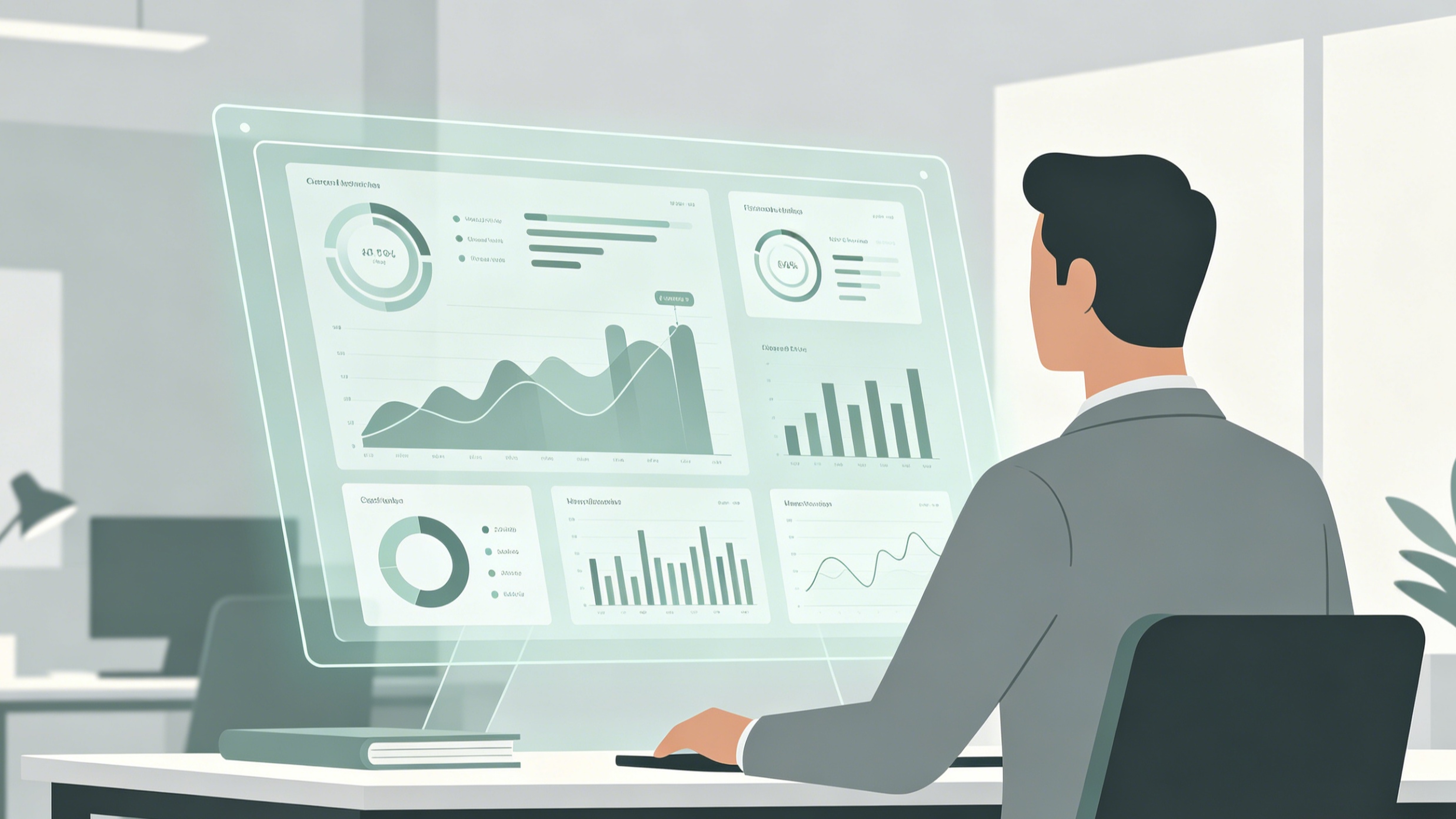
Data Visualization: Making Numbers Speak
Data is only as valuable as the insight it provides. Simply pasting a spreadsheet into a slide is no longer acceptable.
Choosing the Right Chart Type
- Bar Charts: Best for comparing different categories or showing changes over time when the number of periods is small.
- Line Charts: Ideal for showing trends over long periods.
- Pie Charts: Use sparingly, and only to show parts of a whole (keep categories to 5 or fewer).
- Donut Charts: A modern alternative to pie charts that allows space for a central key metric.
The "Highlight" Technique
Instead of showing all data points with equal weight, use color to direct the audience's eye. Keep most of the chart in a neutral gray and highlight the specific bar or line that represents your key takeaway in a bold, brand-aligned color. Add a direct label to this data point so the audience doesn't have to search for the value.
Animation and Transitions: The Art of Subtlety
Animations should facilitate understanding, not serve as decoration. Over-animating is a hallmark of amateur design.
Transition Choices
In 2026, the "Morph" transition is the gold standard. It creates seamless movement between slides by recognizing common elements and animating their change in size, position, or color. It is far more professional than traditional fades or wipes.
Entrance Animations
Use simple "Appear" or "Fade" animations for bullet points to prevent the audience from reading ahead while you are still speaking on the first point. Avoid "Fly-in" or "Bounce" effects, which can be distracting and consume unnecessary time during the presentation.
Optimizing for Different Contexts
Modern presentations are often viewed without a presenter. Your deck must be able to stand on its own.
Designing for Asynchronous Reading
If you are sending the deck via email or Teams, use the "Speaker Notes" section extensively or incorporate a summary slide at the beginning. Ensure that each slide has a descriptive headline (e.g., "Revenue Increased by 15% in March" rather than just "Revenue Results").
Mobile-First Optimization
Test your presentation on a mobile device. High-contrast colors (dark text on a light background or vice versa) and large icons are essential for users viewing your work on the go. Ensure that buttons or interactive elements are large enough to be "tapped" easily.
Final Checklist and Technical Review
Before finalizing your PPT, conduct a thorough quality check:
- Spell Check: AI can sometimes introduce subtle errors in generated text. Always proofread manually.
- Link Verification: Ensure all internal links (to other slides) are functional.
- Accessibility: Check the reading order of elements on each slide to ensure screen readers can interpret the content correctly. Use Alt-Text for all images and charts.
- File Format: Save the file as a standard presentation format (.pptx) for editing, but consider exporting a flattened PDF version for distribution to ensure that fonts and layouts remain locked across all devices.
- File Size: Compress images to ensure the deck is small enough to be sent via email without needing external download links.
By following this structured approach, making a PPT becomes less about software manipulation and more about effective communication. The focus remains on clarity, accessibility, and the strategic use of modern tools to deliver a message that resonates in a fast-paced digital environment.
-
Topic: Step-by-step directions for mahttps://www.bu.edu/celop/dev/pdf/PowerPoint.pdf
-
Topic: Create a presentation in PowerPoint - Microsoft Supporthttps://support.microsoft.com/en-au/office/create-a-presentation-in-powerpoint-422250f8-5721-4cea-92cc-202fa7b89617?nochrome=true
-
Topic: PowerPoint design ideas and tips for 2026 | Microsoft PowerPoint Bloghttps://powerpoint.cloud.microsoft/create/en/blog/powerpoint-design-ideas/